Health,
designed
for humans

The single place for everything Significo. Logos, colors, type, voice and ready-to-use assets — built for clarity, made for care, so anyone on the team can stay on brand.

Significo monogramSignifico · Brand System

Jump straight to what you need

The four things teammates reach for most. Or press ⌘K to search anything.

Six chapters, one brand

Each chapter is self-contained — open the one you need, or read end to end.

Three ideas guide every decision

When in doubt, come back to these. They keep the brand consistent even when the medium changes.

Human-first

We design for people, not users. Language is warm, clear and free of unnecessary jargon — every choice leads with empathy.

Clarity over cleverness

Every element earns its place. If it can be removed without loss, it should be. Simplicity is a feature, not a constraint.

Optimistic by default

Technology can genuinely improve lives. Our system reflects possibility and care in its color, type and tone.

Tone of
Voice

Our voice reflects who we are — a health technology company that puts humans at the center of everything. These guidelines ensure consistency across all written touchpoints, from UI copy to marketing materials.

Writing principles

Human-first

We speak to people, not users. Our language is warm, clear, and free of unnecessary jargon. We prioritize empathy and understanding in every message.

Confident, not arrogant

We know our craft and share knowledge with authority, but always remain approachable. We guide rather than lecture.

Clear and concise

Every word earns its place. We avoid filler, buzzwords, and overly complex sentences. If it can be said in fewer words, it should be.

Optimistic and empowering

We believe technology can genuinely improve lives. Our tone reflects possibility, progress, and the positive impact of good design in healthcare.

Say this,
not that.

Voice

Use active voice and direct language.

Instead of

Use passive voice or vague phrasing.

Action

“Get started with your wellness plan”

Instead of

“A wellness plan can be initiated by the user.”

Address

Address the reader as “you.”

Instead of

Refer to “the user” or “one.”

Rhythm

Keep sentences short and scannable.

Instead of

Write long, complex paragraphs that bury the point in qualifiers and asides.

Inclusion

Write plainly, for everyone.

Instead of

Hide meaning behind clinical jargon.

Direction

Tell people exactly what to do next.

Instead of

Stay vague and leave them guessing.

Colors and
Variables

All colors are defined as CSS custom properties and support light/dark mode switching. Toggle dark mode to see live values update across the palette.

The palette

Neutral scale
Mode-aware · 04 steps
Primary
Static across modes · Brand
Secondary tints
Accents · Cards · Highlights
Dark accents
Deep tones · Backgrounds

Approved
combinations

Primary pairings
03 pairings · Heroes and statements
Dark and tint backgrounds — accent text
03 pairings

Health, designed for humans.

Health, designed for humans.

Health, designed for humans.

Secondary tints — black text
05 pairings · Safe defaults

Health, designed for humans.

Health, designed for humans.

Health, designed for humans.

Health, designed for humans.

Health, designed for humans.

Neutral background — colored text
04 pairings · UI defaults

Health, designed for humans.

Health, designed for humans.

Health, designed for humans.

Health, designed for humans.

The gradients

Incorrect usage

Never combine dark text on dark backgrounds or light text on light backgrounds. These pairings fail contrast requirements and make content unreadable. Hover any card to flag why it fails.

Dark text on dark backgrounds

Health, designed for humans

Gray-Dark + BlackFails contrast

Health, designed for humans

Blue + BlackFails contrast

Health, designed for humans

Lavender + Gray-DarkFails contrast

Health, designed for humans

Orange + Gray-DarkFails contrast

Health, designed for humans

Yellow + Orange-LightFails contrast

Light text on light backgrounds

Health, designed for humans

White + YellowFails contrast

Health, designed for humans

Yellow + WhiteFails contrast

Health, designed for humans

Orange-Light + Lavender-LightFails contrast

Health, designed for humans

Blue-Light + Green-LightFails contrast

Health, designed for humans

Lavender-Light + Yellow-LightFails contrast

Typesetting

Three families. Satoshi carries the body and UI, PP Neue Machina sets the voice in display, and Platypi italic accents the moments that matter — never decoration, always meaning.

The families

Primary
Satoshi

Body copy and everyday UI.

Secondary
PP Neue
Machina

Headlines and display moments.

Accent
Platypi

Italic only — one word per heading.

Type scale

Showing: Desktop sizes. All values scale at tablet and mobile breakpoints — use the text-* tokens, never hard-coded pixels.

Display 4XL
Display 4XL PP Neue Machina · Hero
text-4xl
extralight
Display 3XL
Display 3XL PP Neue Machina · Section
text-3xl
extralight
Display LG
Display LG PP Neue Machina
text-display-lg
extralight
Display MD
Display MD PP Neue Machina
text-display-md
extralight
Display SM
Display SM PP Neue Machina
text-display-sm
extralight
Title / H3
Title PP Neue Machina · H3
text-2xl
medium
Subtitle / H4
Subtitle PP Neue Machina · H4
text-xl
medium
Body text — readable, comfortable, calm.
Body Satoshi · 16px
text-base
medium
Small / Label
Small Satoshi · 14px
text-sm
bold
Extra small — captions and fine print.
Extra Small Satoshi · 12px
text-xs
medium
2XS · Micro label
2XS Satoshi · 11px
text-2xs
bold
3XS · Tag
3XS Satoshi · 10px · Tags
text-3xs
bold

Font weights

Aa
Extra Light200 · PP Neue Machina
Aa
Regular400 · Satoshi
Aa
Medium500 · Satoshi
Aa
Semi Bold600 · Satoshi
Aa
Bold700 · Satoshi
Aa
Display Bold700 · PP Neue Machina
Aa
Italic Accent400 italic · Platypi

The italic gesture

A health platform that actually understands you.

Care that listens.
Tech that thinks.

The accent word.

Lift exactly one word per heading — the verb, the feeling, the promise.

/01A health platform that actually understands you
/02Care that listens
/03Tools to do the work
/04Built to last

Typography rules

Tokens, not pixels

Use text-* tokens. Never hard-code pixels.

One italic per heading

Accent a single word in Platypi italic — never two.

Display stays tight

Display tracks -0.03em; body -0.005em; micro labels uppercase at +0.14em.

Body defaults to Medium

Satoshi 500 for body. Bold (700) only for labels — never whole paragraphs.

Don't upright Platypi

Platypi is italic-only. Need an upright? Use PP Neue Machina.

Respect the floor

Body min 12px (9pt print). Micro labels stop at 10px.

The
mark

Two assets carry the brand: a wordmark for full presence and a monogram for tight spaces. Both share the same DNA — confident geometry, generous curves, no compromise.

The wordmark

The Significo wordmark is set in a custom-modified typeface that balances geometric precision with approachable curves. The registered trademark symbol sits at the top-right of the final letterform.
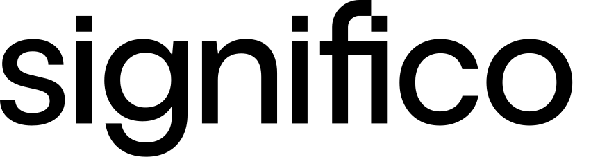
Significo wordmark

The monogram

Brandmark. The Significo brandmark is built on a modular grid system. Its form is derived from the letter “S”, constructed using a combination of rounded and geometric shapes that convey fluidity, connection, and forward momentum. The small square element at the top-right signals technology and digital precision.

Blue#3053F9
Significo monogram on blue
Orange#FF6432
Significo monogram on orange
Black#000000
Significo monogram on black

The combos

Horizontal Combo

Monogram + wordmark, single line
Dark
Significo
Light
Significo

Vertical Combo

Monogram stacked above wordmark
Dark
Significo
Light
Significo

Clear space

1X1X1X1X

One X on every side.

X equals the height of the monogram's square mark. Apply this minimum on all sides of both the wordmark and the monogram — no graphic, text or edge should encroach on this zone.

Minimum clear space, all sides1X
Recommended on hero / cover2X
Min size — digital16px
Min size — print10mm

Don't do this

×
Rotation

Don't rotate the mark.

The wordmark and monogram always sit on a level baseline. No diagonals, no tilts, no orbits.

×
Distortion

Don't stretch or squash.

Maintain the original aspect ratio. Scale uniformly — never warp one axis to fit a container.

×
Color

Don't re-tint the mark.

The mark is always solid black or solid white. No gradients, no brand-color fills, no two-tones.

×
Effects

Don't add effects.

No drop-shadows, glows, bevels, outlines or 3D extrusions. The mark performs unadorned.

How to use

Wordmark first

Default to the wordmark whenever space allows. The monogram exists for moments where the wordmark would be illegible — favicons, app icons, tight corners.

One per surface

A single mark per page, slide or composition. Repeating the logo dilutes its presence — let it anchor, then let the rest of the layout breathe.

Solid colors only

Black on light surfaces, white on dark. The mark never sits on busy photography or gradients without a solid backdrop — readability is non-negotiable.

Downloads

Everything you need to build on-brand. Logos in every lockup and the full typeface family — grab one asset or take the lot.

Logo files

Grab everythingAll 8 lockups · SVG + PNG
Significo horizontal logo, dark on light
Horizontal · LightDark mark · light bg
Significo horizontal logo, white on dark
Horizontal · DarkWhite mark · dark bg
Significo vertical logo, dark on light
Vertical · LightStacked · light bg
Significo vertical logo, white on dark
Vertical · DarkStacked · dark bg
Significo wordmark, dark
Wordmark · LightType only · dark
Significo wordmark, white
Wordmark · DarkType only · white
Significo monogram, black
Monogram · BlackIcon · light bg
Significo monogram, white
Monogram · WhiteIcon · dark bg

Typefaces

Satoshi
Primary · Body and UISatoshi Substitute for you: Space Grotesk

The workhorse for body, UI and navigation. Free from Fontshare; use Space Grotesk where Satoshi isn't licensed.

PP Neue
Machina
Secondary · DisplayPP Neue Machina Substitute for you: Plus Jakarta Sans

Sets the voice in headlines and display. Licensed from Pangram Pangram; use Plus Jakarta Sans as the open stand-in.

Platypi
Accent · ItalicPlatypi Italic only · the signature gesture

Lifts one key word per heading. Free and open-source on Google Fonts — install the italic styles.
Sign off

Your Significo sign-off, built in seconds. Fill in your details, pick a style, and copy a pixel-perfect signature straight into Gmail or Outlook.

Live tool·Copy and paste

Signature generator

Data

BerlinAustinMadrid

Styling

ColorBlack
StaticAnimated
SmoothIcons

Preview