The
mark
Two assets carry the brand: a wordmark for full presence and a monogram for tight spaces. Both share the same DNA — confident geometry, generous curves, no compromise.
The wordmark
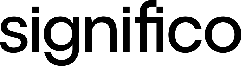
The Significo wordmark is set in a custom-modified typeface that balances geometric precision with approachable curves. The registered trademark symbol sits at the top-right of the final letterform.
The monogram
Brandmark. The Significo brandmark is built on a modular grid system. Its form is derived from the letter “S”, constructed using a combination of rounded and geometric shapes that convey fluidity, connection, and forward momentum. The small square element at the top-right signals technology and digital precision.

The combos
Horizontal Combo


Vertical Combo
Clear space
One X on every side.
X equals the height of the monogram's square mark. Apply this minimum on all sides of both the wordmark and the monogram — no graphic, text or edge should encroach on this zone.
Don't do this
Don't rotate the mark.
The wordmark and monogram always sit on a level baseline. No diagonals, no tilts, no orbits.
Don't stretch or squash.
Maintain the original aspect ratio. Scale uniformly — never warp one axis to fit a container.
Don't re-tint the mark.
The mark is always solid black or solid white. No gradients, no brand-color fills, no two-tones.
Don't add effects.
No drop-shadows, glows, bevels, outlines or 3D extrusions. The mark performs unadorned.
How to use
Wordmark first
Default to the wordmark whenever space allows. The monogram exists for moments where the wordmark would be illegible — favicons, app icons, tight corners.
One per surface
A single mark per page, slide or composition. Repeating the logo dilutes its presence — let it anchor, then let the rest of the layout breathe.
Solid colors only
Black on light surfaces, white on dark. The mark never sits on busy photography or gradients without a solid backdrop — readability is non-negotiable.